Release 48
Author Release 48
14 min read
2025/06/30
Avallain Author Release 48: Redesigned Bookmaker, enhanced hotspot usability, powerful shared content options and more.
Backend Enhancements
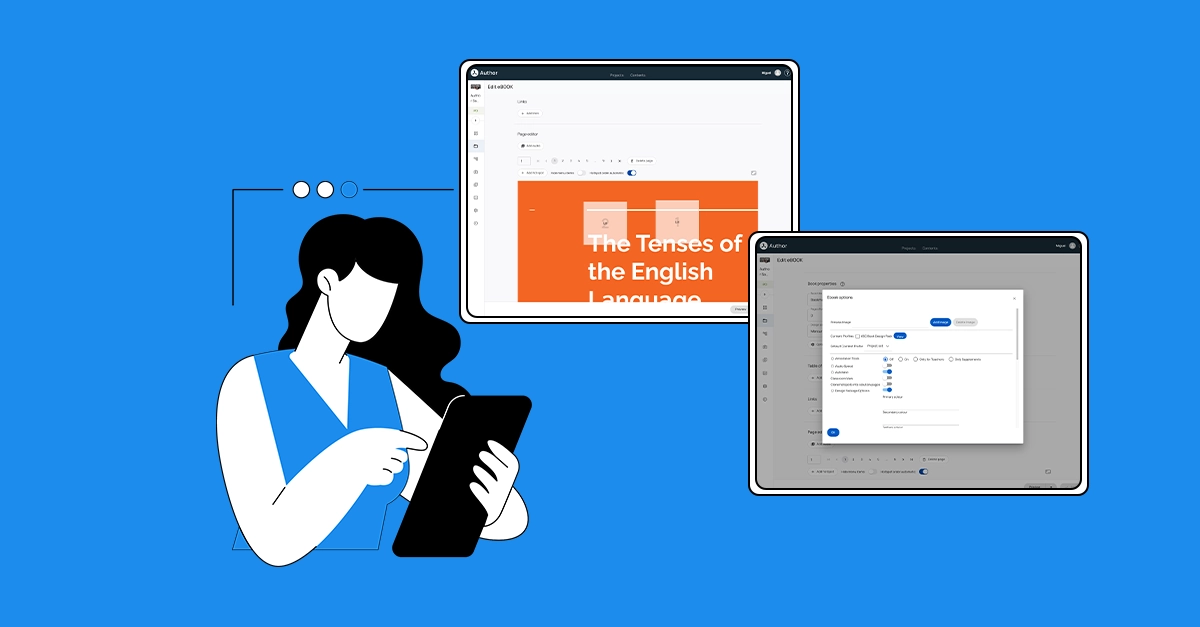
Bookmaker
The Bookmaker has been redesigned.
New eBook creation workflow
When selecting “eBook” from the Create LO dropdown, a dialog appears prompting the user to enter a book name, as before. However, now:
- Users need to select a PDF or ZIP file from the Media Library, which opens in a dialog filtered to Documents. Only single file selection is allowed.
- The “Cancel” button remains available at all times.
- The “Create” button is disabled by default and becomes enabled only after a valid asset has been selected.
- After clicking the “Create” button, the eBook import process begins. The user remains on the Work Package screen and can close the popup while the import continues in the background. Once the import is complete, a confirmation popup will appear with a link to go to the eBook.
Sections restructure
The previous Import section has now moved to the top of the page.
The two functions from the Create workflow are kept together in the top field of the Editor: Book name and Import Log.
The name can be directly edited. New pages or solution pages can be imported by clicking on the pencil icon.
When the user clicks the pencil icon, the Media Library popup opens, allowing file selection for import. Once a file is selected, a new Start button replaces the pencil and offers the same functionality as the original Import button.
Zips of audio files are also imported here.
The Import Log is now positioned next to the pencil icon.
Book properties
The Properties section now includes the Book title, Page offset, and the Design pack dropdown. Additionally, eBook Options and Metadata have been moved into this new section and are displayed beneath the Design pack dropdown.
Table of contents and Links
The Table of contents and Links feature updated input fields and save functionality. When either of the buttons is clicked, Save and Close options will appear below the field, enabling the respective actions. All remaining functionality remains unchanged.
Page Editor
The section has been visually restructured and improved for easier navigation and a better experience.
- The Add Audio option is now presented as a button that opens the Media Library when clicked, allowing the user to select the desired file. Once the asset is imported, the Add Audio button is replaced by an audio player with the same functionality as before. Users can also replace or remove the audio asset using the buttons next to the player.
- Page navigation continues to include an input field for a specific page number, as well as an extended page selector and arrow-based navigation for easier browsing. Users can delete a page using the button next to page navigation, just as before.
- The Add Hotspot button remains unchanged.
- The Hide menu item feature is now presented as a switch: when enabled, menu items will be hidden. Similarly, the Hotspot Order setting has been updated to a switch. By default, it is ON. Disabling it allows the hotspots to be ordered manually, as before (but see below).
- New functionality: Scale factor (far right) has been added to the page editor. This allows the user to determine the magnification of the page in the editor.
- Normal view and Solution view are now displayed as separate buttons on the right side of the page editor section. When Solution view is enabled, the Add Hotspot button will now be disabled to prevent the confusion of adding a hotspot and not seeing it on the solution page.
Hotspots
Although all current functionality is retained, hotspots in Release 48 can boast of much improved usability.
- Right-click on the page triggers a context menu with two functions: Add Hotspot and Delete all hotspots: use with caution!
Note: It is still possible to add a hotspot with a double click on the page. - Rollover of a hotspot produces a context menu above the hotspot that is much easier to navigate. There are three functions: Edit, Copy, and Delete.
- Right-click makes available the same functions.
- With automatic hotspot ordering turned off, the rollover context menu includes ordering arrows on the left.
- Edit Hotspots menus have been visually updated and use the same components as the Media Library, Structure, and Products pages. Hotspot menu functionality remains the same.
Save and Preview
Save and Preview actions remain at the bottom of the page, with changed order. Now the Save action will be on the right, highlighting the primary action.
The Save action will be disabled and will become active upon changes made in any sections besides Options and Metadata, as changes in those sections are directly propagated.
Note: The Publish and Delete actions are currently hidden; support for these will be added in future releases. Until then, you can delete or publish your digital books from the Work Packages screen.
Hotspot type: URL: New functionality
The hotspot functionality has been enhanced to support opening URLs in an iframe over the book. New fields for Target and Launched content have been added to the hotspot configuration, matching the options available in the LO hotspot.
Note: Some sites disallow being displayed in frames. In such cases, the only solution is to open the URL in a new tab.
Projects Page: New design
The Projects page is now the first page you see after logging into Author. The old Welcome page has been removed.
What’s New section
Instead, recent news about Author can now be found at the top of the Projects page in the What’s New section.
My Projects
Below What’s New you can find your projects. In the Suggested section, users with access to more than seven projects are now presented with a list of the three most used projects (selected by either choosing the projects used most in the last week or the last visited projects).
Page components
To keep consistency across pages, Filters have now moved from the Search input into a separate button and will appear on the right when launched, the same as in Media Library.
Sort has also moved next to Search. Note that the sorting logic has been fixed:
- Sort by Name: Projects are sorted alphabetically.
- Sort by Date Created: Projects appear in order of creation, with the most recently created at the top.
- Sort by Date Updated: Projects are sorted based on changes made to Project Settings.
Card and table components
Cards now display the project title, description, user role, user count, LO count, and tasks on the card tiles instead of in the tooltip.
This information is visible in both card view and list view. In the list view, the information is shown in columns.
Media Library
Asset accessibility panel: New behaviour
In the Media Library’s metadata editor, changes in the Accessibility panel will no longer be auto-saved. While the accessibility status will still update automatically when metadata is edited, users will now need to manually click Apply on the accessibility section to confirm and apply the changes.
Edit Subtitles/Edit Transcripts
The Edit Subtitles/Edit Transcripts popup for video assets, and Edit Transcript for audio assets, have been updated with a new layout. When opened, users will now see two tabs on the right of the asset: Preview and Edit.
The Preview tab displays the selected format and the text for chosen accessibility data, while the Edit tab allows users to edit, update, or generate subtitles/transcripts either manually or by using AI. The Generate with AI button has been moved out of the editor view and is now located above the Type dropdown. Clicking on the Generate with AI button will start the process and the popup will be closed automatically. Users will be notified once the process is completed and will be able to open, preview, and edit the generated content.
To apply manual changes made in the popup, the user should click the Apply button. Clicking Close will discard any changes and close the popup.
Mark image as decorative: New behaviour
The Mark image as decorative option will now work as follows:
- If an asset is already used in an LO and the user later marks it as decorative in the Media Library, Author will propagate empty altText=”” and title=”” to all LOs containing that asset.
Note: Author will not remove the alt text from the metadata itself: it will remain stored. - If a user inserts an asset that is already marked as decorative into an LO and has altText=”Alternative Text” in its metadata, Author will display the alt text and title fields as empty in the Media Properties dialogue.
- If the asset does not have alt text in its metadata, empty altText and title will be propagated to the LOs containing the asset.
- However, we will not restrict users from manually entering an alt text in Media Properties at this point. If they do, the altText and title will be included in the resulting XML.
Note: When asset accessibility metadata is edited and propagated, an LO history version will no longer be created in the linked LOs.
Tracking metadata changes in LO history
Metadata edits will now be captured in the LO history, including the username of the person who made the changes. This applies to LO metadata, activity metadata, and answer metadata edits. This enhancement helps content operations specialists track metadata input errors more easily and identify the users responsible for changes. The User Action listed is “edited LO metadata”.
Bulk unlocking of LOs
Bulk unlocking of LOs in Author is now supported, alongside bulk locking.
Project Reports
New column: “Content profile selected”
In Project and Full Project reports, there is a new column “Content profile selected”. This lists the Content Profile(s) selected in the LOs and eBooks.
Content Editing
Shared text object: Reusable text
It is now possible to create a text, share it with multiple LOs, and edit it in one place. The text can be displayed in either Supplements or Attachments.
To enable: select the Global Option, Shared Text Objects, in the Product Type and then in the Project.
Creating a Text Object in Supplements or Attachments
There is now a checkbox called Shared text object at the top of the editing page. Select it. Create your text and insert the image, audio, or video.
Shared objects are visually indicated in the Supplement and Attachment screens for easy identification using an icon with the label Shared:
Using a shared text object
The Add Object button in Supplements and Attachments has a new value: Add Shared Text. Click this to launch a dialogue with a list of all the Shared Texts in the project. Select one and click Add.
When editing a shared object, creators can choose to:
- Apply changes to all linked LOs.
- Save changes only in the current LO, breaking the link with other LOs. The link cannot be restored once broken.
When copying projects or LOs that include shared objects, all shared data and links are preserved. However, shared objects in the target project are independent of those in the original project.
A new filter in the Work Packages view allows creators to see all shared objects and their usage across LOs. This improves project oversight and navigation.
An LO history version will not be created when shared text changes are updated and propagated.
New special character set: Māori
A new special character set, Māori, is now available for students and writers.
LO Creation: Warning
In the LO/eBook Create dialogue, a warning message will be displayed to inform the user that spaces and all special characters in the Name/Title will be replaced by underscores during export.
Note: LO creation is not blocked with this message.
Editing Source Code: New behaviour
When editing in CKEditor source code, the user will need to follow a fixed editing sequence when adding tags.
- First add the opening tag, i.e. <p> including its closing pointed bracket.
- The Text Editor then automatically adds the closing tag, i.e. </p>.
- Next, the cursor is moved in between the opening and closing tag, allowing content creators to seamlessly add the element content.
Manually adding closing tags can lead to invalid HTML and should be avoided.
Options
Project options
SCAYT
A new project option for the SCAYT plugin has been added to enable/disable it at the project level. Upon deployment, the setting will default to OFF.
To enable: select the Global Option in the Product Type and then in the Project.
LO Options
Send Scores
A new option value has been added to Send Scores called All Check Answers. With this enabled, on every screen that the user clicks Check Answers, the score will be sent to the platform.
The Send Scores button will not display on any screen.
To enable: no action needed.
Global Options
Confirm Before Close
This option determines whether a warning dialogue should appear before the LO is closed via the LO Close button. This enhancement ensures that users are properly informed before exiting and helps prevent accidental loss of progress.
Available Options:
- If Unsubmitted: A warning dialogue is displayed if the LO has not yet been submitted:
- With Show Submit and 1 submission: the warning displays before Submit is pressed.
- With Show Submit and multiple submissions: the warning displays until the final submission has been used.
- With Finish Submit: the warning displays before Submit is pressed.
- With Show Submit and 1 submission: the warning displays before Submit is pressed.
- Always: A warning dialogue is always displayed whenever the user attempts to close the LO, regardless of the LO’s state.
- Off: No warning dialogue is displayed when the user closes the LO.
To enable: select the Global Option in the Product Type and then the Project.
Note: This feature requires design pack support. Mercury currently does not support it.
Activity Type Options
Feedback Empty
Show feedback for unattempted questions with the new option, Feedback Empty. It can be used together with Feedback Correct and Feedback Incorrect, so that all three possible states can be addressed: a correct answer, an incorrect answer, and now, a blank answer.
Note: This option has the same scope as the existing Feedback Correct and Feedback Incorrect options. The input field for the Custom value of the options has been updated to support multiple-line feedback.
The option has two values: No (default) or Custom. If set to Custom, the feedback given in the multi-line field will be used for empty answers. Only plain text is supported for feedback, but Feedback Empty supports the #correct_answer# and #wrong_answer# syntax to display correct/incorrect answers given by the learner within the feedback text.
By default, Feedback Correct/Incorrect/Empty are displayed as tooltips with Check Answers.
To enable: select the Activity Option in the Master Activity Type and then the Project Activity Type.
Automatic Play
The Slideshow Activity Option Automatic Play now supports a new option value: On and Magnify. If enabled, the current image will be briefly magnified before the next image is displayed.
To enable: no action needed.
Miscellaneous
Print solution pages
When eBook solution pages are in view and the user clicks Print, it will be the solution page that is printed. This behaviour only applies to the global solution-page button. It does not apply to Single and Progressive solution reveal hotspots.
Record idle time
It is now possible to record idle or inactive time while a student has an LO open. Idle time is the period the user spends with no mouse, touch, or keyboard actions. Playing or pausing a video or audio, adjusting the volume are also considered actions that reset the inactivity timer.
Idle time is only reflected in the data sent to the hosting environment if it is higher than a threshold defined in the Design Pack.
Mercury: Enhanced design and functionality
Enhancement to the microphone test dialogue
When the Display Recording Test option is enabled, a dialogue appears with a dropdown menu to select the microphone. This allows users to easily verify which microphone is in use, check if it is receiving input, and confirm that the necessary permissions are granted.
Language Confidence in Pronunciation (Input:Match:Voice)
Language Confidence ratings are now available in Pronunciation (Input:Match:Voice).
Validation buttons
Validation buttons have been moved to the primary toolbar. Previously in Mercury DPs, the primary toolbar at the footer of the screen was designed to contain up to three buttons for the most critical actions (typically Back/Forward navigation and a submitting action). The tertiary menu, positioned at the side of the screen, contained secondary actions.
Now:
- Validation buttons (Try Again, See Answers, Results, Check Answer) appear in the LO Footer.
- Submit and Send Scores actions continue to be in the footer (Send Scores and Show Submit are never used together).
Note that a custom title for the Submit button can enable a horizontal scroll in the footer. - Show Forward and Previous controls are changed from title to arrow icons and aligned right and left.
- The visuals for secondary actions have been updated following an accessibility enhancement.
- With only Previous/Show Forward actions enabled, the Show Forward action can rise in the hierarchy from secondary to primary.
- Floating side buttons (e.g. Hint, Annotation) are not affected by this change.
Validation marks for AT Highlighting
The validation marks in the Highlighting Activity Type (Identify:Mark:Marking) have been restyled. Now the highlighted items are filled with the appropriate colour, and the checkmarks are displayed inside the marked area.
Attachments: Show as Modal
Mercury DPs interpret the attachment link value Show as Modal to allow the attachment to be opened from a different location on the screen, rather than from the header. The open/close behaviour of the attachment is not influenced by this setting.
When attachments are defined as modal, they can be opened by clicking a chip below the rubric. With many attachments, items are stacked and wrapped in several lines if needed. Grouped attachments are shown in single access, including a counter with the number of unopened attachments.
Improved Display for Video Transcripts
It is now possible to resize the transcripts pane, and scrolling with the mouse wheel is smoother and more efficient.
Watch the webinar recording
Learn more about this release’s new features by watching the recording of the webinar held by our in-house experts.

Latest product releases
Explore more features recently added to our products.