4 min read
2020/06/12
To us at Avallain, the year 2020 bears special significance, as we approach the beginning of our third decade in business. For us, this is a cause for introspection as much as celebration. We are proud to say that Avallain has quickly evolved from a 3-person company into one of the world’s leading providers of software solutions for digital education. To represent this tremendous forward momentum, we have decided to develop and re-design Avallain’s visual identity.
What it means to represent Avallain’s identity
In 2000, two years before the official founding of the company, Ursula Suter and Ignatz Heinz, co-founders of Avallain came together to decide upon the brand that would represent their new company for years to come. They quickly agreed that the Avallain logo would have to be more than just a recognizable symbol – it would need to represent the very identity of the company they were hoping to build.
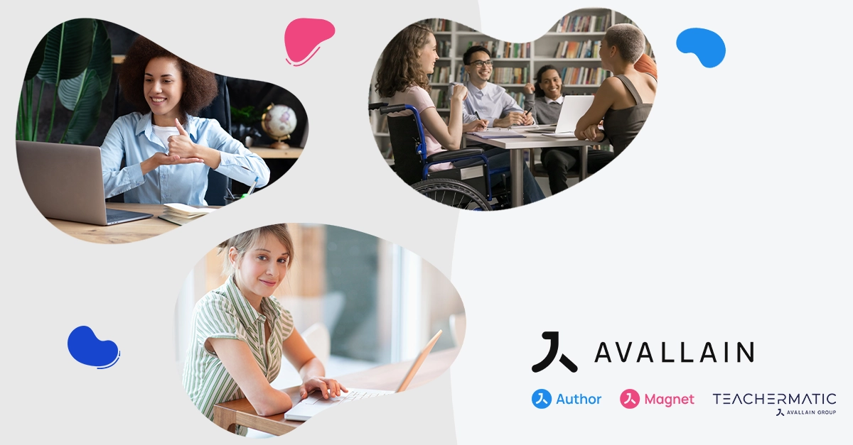
Since the founding days, the core of this identity has always been the will to use education technology as a way of enhancing human lives all over the world. Thus, Avallain has always focused on the human element, from learners and teachers to our customers as well as our own staff, and symbolized by our use of the symbol “ningen” – the Japanese word for “human”. Thereby, the original concept of the Avallain corporate identity was born.

Our human-centered symbolism was a statement of intent as much as a brand: Today, some twenty years later, we have successfully aspired to the ideal of an international company identity, building relationships and understanding with as many cultures and countries as possible by putting people at the center.
Avallain now holds a presence on five continents and employs over 15 nationalities in our staff. Representing our international approach, our focus on the human element and our values of harmony, stability and humanity leading toward exceptional quality and achievement, the Avallain visual identity went through some slight changes in design over the years.

Avallain has 20 employees and is working for Oxford University Press.

Avallain reaches 90 staff and serves 5 Million learners.
Times have changed, our values remain
When we decided to re-design our visual corporate identity, we knew we wanted to keep all of these ideals intact, as they still accurately reflect on the work Avallain does throughout the world of today. We also wanted to represent the current forward momentum of digital education, allowing the human “ningen” to move boldly – but not hastily – into the future.
Thus, our new visual design was born, representing Avallain’s commitment to its original values while commemorating the company’s new, dynamic role in the world of digital education.
Japanese sign for “human” → Reduced shape of the sign → Design mark for Avallain
Our new visual design reflects the identity of Avallain while also signifying the stability which we offer our customers as well as learners and teachers all over the world in an age of unprecedented change.
At the same time, the very act of changing our logo represents our commitment to ceaseless creativity and our willingness to improve upon the old whenever such a change is truly necessary – be it in terms of changing corporate identities or technological innovation.
Avallain fully prepared to grow and lead the digital education market momentum, ready for the next decades.